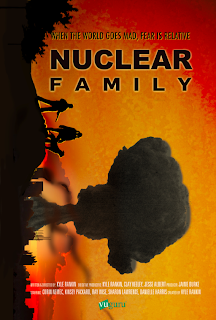
I know, I know, It looks a little too much like Super 8... but thankfully we then used it as a steeping stone to get to this-
This one was my favorite. I would most likely add a few more elements but the general feeling is there. In this round of edits it was decided to drop the vertical idea all together.
Here was my next attempt with a regular horizon line. Just about the same but ultimately it was deemed it looked too much like a pulp fiction novel.
This is the final product- We were able to scrounge some pictures and produce a collage to hint at the apocalyptic world they live in.


No comments:
Post a Comment